Executive Summary
Introduction
Project Proposal
Analytical Methodology
Results
Conclusions
Future Work
References
Appendix 1
Understanding The Model
Appendix 2
Code, and Computations
Appendix 3
History of the AIDS Virus
|
Results
Computer Calculations
The program was run many times so only a summary of one of the runs is given in this section. This is an example of the control run done for comparisons. For this trial there is no cure, no immunization and the populations response is set to 5. The initial parameters are as follows (initial populations are 1/10 of the United States' population in 1990):
- Susceptible Population: 24,815,492
- Infected Population: 3,523
- Susceptible Birth Rate (per 1000): 17
- Susceptible Death Rate (per 1000): 6
- Infected Birth Rate (per 1000): 2
- Infected Death Rate (per 1000): 150
The populations reached a maximum of:
- Susceptible Population: 55,412,044
- Infected Population: 700,972
The final totals for the populations after 150 years are:
- Susceptible Population: 55,412,044
- Infected Population: 387,789
Annual infection rates:
- Average New Infected: 30,788
- Highest New Infected in One Year: 67,583
- Lowest New Infected in One Year:
Initially a different method for modeling AIDS was attempted using statistical curve fitting [2]. It was after this that the SI model was chosen to be the base model. .The SI model is very simple and had to be modified extensively. At this point decisions had to be made regarding how the SI model would be customized. The most difficult decision was which demographics should be included and how to include them. Race was not included as a demographic because the race of each child would have to be determined based on the child's parents. This problem is beyond the scope of this project. Age was included in the model so people of different age groups partake in different activities (i.e. newborns do not have children, old people do not participate in dangerous activities). Another problem encountered is how to implement cures/immunizations. In the end the decision was made to treat cures and immunizations as percentages, which can be changes through the input file.
Graphs, Tables and Figures
Figure 3 shows the infected deaths in relation to different cure rates and cure times. This shows the importance of when the cure is discovered and how effectively the cure can be manufactured. The dark blue control group shows what would happen if no cure were discovered. The longer it takes for a cure to be discovered the more people die. Eventually a cure being discovered does not have a dramatic effect on the deaths in the population because such a large portion of the population is infected. Similarly, if a better (cheaper, more easily manufactured) cure is discovered fewer people die. Year of discovery has a more beneficial effect on the deaths caused by infection.
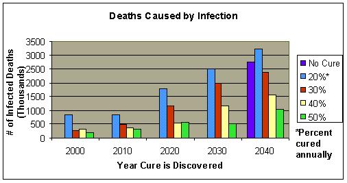
Figure 3
Figure 4 shows the effects of a cure that can be manufactured for only 20% of the population annually. Notice a cure discovered after 40 years does not change the population significantly from the control group. This shows the importance
discovering a cure early. As the cure is discovered later and later it has a smaller and smaller effect on the end results.
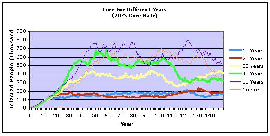
Figure 4
Figure 5 shows the effects of a cure that can be manufactured for 50% of the infected population annually. A cure rate of 50% has a dramatic effect on the infected population regardless of the year of discovery.
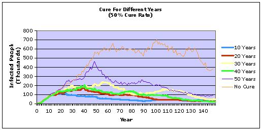
Figure 5
Figure 6 shows the effectiveness of an immunization. The figure shows different immunization rates for an immunization discovered after 50 years (2040). Nearly all of the infected die off, whereas if a cure is used the infected population lingers for much longer.
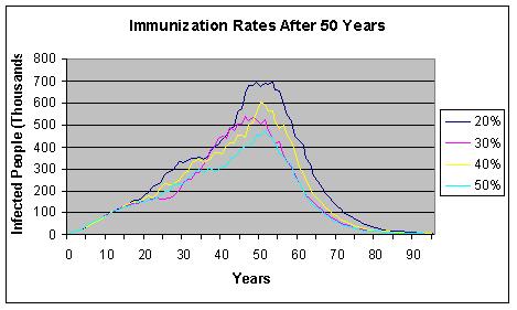
Figure 6
Other Data and Comparisons:
The statistical data plugged into this program was collected from the CDC (Centers for Disease Control and Prevention), which is an organization that has been working to provide up to date information so that people can more effectively combat AIDS/HIV. The CDC has been putting out an AIDS/HIV surveillance report for the past twenty years, ever since the virus was first found to be a major threat to the population. Unfortunately, as the means of diagnosing AIDS was very inexact in the early years that the disease was around, some of the earlier data in these reports is inaccurate. The HIV/AIDS Surveillance Report contains many tables, as well as graphical representations of U.S. AIDS and HIV case reports, including data by state, metropolitan statistical area, mode of exposure to HIV, sex, race/ethnicity, age group, vital status, and case definition category. The report is usually issued in the early fall[3].
Other statistical data that was used in this program was derived from the United States Census Bureau. This organization makes record of the population of the United States, and this data was used, in conjunction with the data taken from the CDC, to derive many of the variables used by this program, such as the number of people that a diagnosed AIDS patient will come into risky contact with in a year [4]. Other data that was used by this program, such as the one to two percent chance that a person can be born immune to AIDS, was collected from the various online and printed news articles that have to do with the subject [5].
|